Key findings
This report asks two questions about the same buildings: does indoor mobile coverage show up in what a London office can charge, and in how long its tenants stay. It builds on Proptivity’s wider coverage study and stands on its own.
higher asking rent for large Grade A offices rated Reliable compared with those rated Poor, once each building’s rent is adjusted for its local peer group.
less space approaching a lease event in Reliable buildings than their local market would suggest. This is the most consistent relationship in the dataset and it holds for Grade A and Grade B separately.
difference in rent or retention between Patchy and Poor buildings, or between degrees of Poor. The premium only appears once a building reaches a genuinely reliable level of coverage.

of central London Grade A office value could be recovered by fixing poor indoor coverage, on a conservative estimate. For a single poorly connected 200,000 sq ft building the gap is worth roughly £1.5m a year in rent.
of the large Grade A offices we measured combines a Poor coverage rating, no refurbishment on the horizon, and more than 10% of space reaching a lease event within three years. Seventeen buildings carry the compounded risk.

Executive summary
Two Grade A buildings can sit on the same street, match each other on specification and sustainability rating, and still perform very differently, for reasons that go beyond location, fit-out and amenity: part of the gap comes down to something valuers rarely look at, whether the phones work inside.
We measured indoor coverage across 472 Grade A and Grade B offices in Greater London and compared each building’s commercial performance with its local peer group, which takes location out of the comparison. Two results came through clearly. Large Grade A offices rated Reliable command around 10% higher asking rent than those rated Poor. Reliable buildings also have considerably less space approaching a lease event than their local market would suggest, roughly nine percentage points less, because their tenants have signed longer and renewed earlier, while tenants in poorly covered buildings have kept their options open.
What we didn’t find mattered as much as what we did: between mediocre and bad coverage the market shows no difference at all, neither in rent nor in retention, so improving a building from terrible to merely bad earns nothing. The premium only appears once a building reaches genuinely reliable coverage, and just 31 of the 472 buildings we measured are there.
None of this shows up in an owner’s normal reporting, since occupancy looks fine and the rent roll looks stable while the actual risk sits in how much income is coming up for a decision over the next few years, in buildings that will go into those negotiations at a disadvantage. Owners of poorly connected buildings with leases rolling in the next three years should have this on the risk register already.
We measured indoor coverage across 472 Grade A and Grade B offices in Greater London
About this report
This is a companion to Proptivity’s report Attractive London offices and the indoor mobile coverage gap, referred to here as the coverage report. That study measured indoor mobile coverage across 472 Grade A and Grade B office buildings in Greater London; its findings are summarised in the next section. This report takes the same buildings and asks what coverage is worth: in rent, and in how long tenants stay.
Coverage was measured using Ookla® Cell Analytics™ signal readings taken inside each building, drawn from everyday use rather than a one-off survey and combined across the major operators. Each building gets a plain-language verdict instead, Reliable, Patchy or Poor, based on how much of it holds a usable signal. The commercial side draws on building and leasing data from CoStar® covering asking rent, lease expiry and lease length.
The same method runs through everything in this report: comparisons are made among Grade A offices of 100,000 square feet and above, comparing buildings rated Reliable against those rated Poor, with every commercial measure set against each building’s local peer group benchmark, so each building is compared with offices in its own part of London rather than with the market as a whole. Figures are relative differences and aggregates, and no individual building is identified.
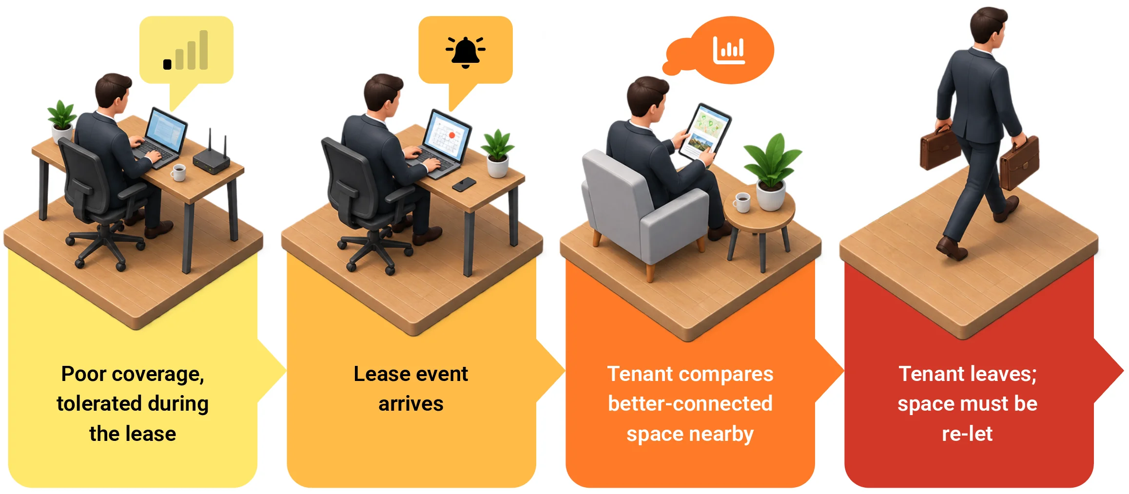
Why coverage problems surface at the lease event:
an irritation that is tolerated mid-term becomes a reason to leave once the tenant has a choice.
What the coverage report found
The coverage report measured indoor mobile coverage across 472 Grade A and Grade B offices in Greater London. Fewer than one in ten delivered reliable coverage, and 49% were rated Poor, meaning large parts of the building could not hold a usable signal.
The Grade A label made no difference, with those buildings no better connected than Grade B, if anything slightly worse. Coverage was weakest in the stock the market prices highest: the largest buildings (60% Poor between 250,000 and 500,000 square feet), the most energy-efficient (55% of BREEAM Outstanding rated Poor), and those framed in steel or concrete.
It is worth holding on to two of those figures while reading this report. Only 31 of the 472 buildings achieve a Reliable rating. And 49 buildings, one in ten, have a majority of their readings struggling; in those buildings a failed connection is the normal experience rather than the exception, and together they carry 13% of all the floorspace in the sample.
None of this fixes itself over time, because energy-efficient glazing and dense, sealed facades, now standard, block the signal arriving from outside, and higher 5G frequencies are weaker at getting through walls. A building that was adequately covered ten years ago can be poorly covered today without anything about it changing. The coverage report sets out the full picture and methodology.

Only 31 of the 472 buildings achieved a Reliable rating.
The rent premium
Ask what drives Grade A rent and the usual answers come back: location, specification, amenities and the sustainability rating. Coverage rarely makes that list, even though it is one of the first things a tenant tests on a viewing and a routine complaint once they have moved in. Valuers don’t measure it and landlords don’t disclose it.
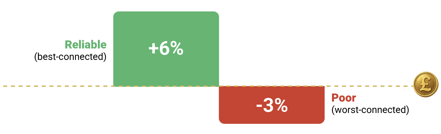
So we measured it ourselves, comparing Grade A buildings of 100,000 square feet and above with each building’s asking rent set against its local peer group. Buildings rated Reliable command around 10% more than buildings rated Poor, with the Reliable group sitting about 6% above its local peers and the Poor group about 3% below. Before the location adjustment the raw gap is around 12%, and controlling for location only trims a couple of points off it, which tells us the premium is not simply a matter of better-connected buildings sitting in better locations.
Asking rent versus each building’s local peer group:
That premium doesn’t taper in, either: Patchy buildings rent no better than Poor ones, and within the Poor group a building where 45% of readings struggle rents no differently from one where 65% do. Occupiers seem to treat coverage as a verdict rather than a percentage, and the market prices it the same way, either the building works or it doesn’t, and only the buildings that work carry the premium. For anyone weighing a partial fix, that’s a hard result: moving a building from bad to mediocre, with a repeater or a patch for the worst floors, earns nothing that this data can detect. The only step the market rewards is reaching genuinely reliable coverage, and so far only 11 of the 217 large Grade A buildings we measured have taken it.

From rent to asset value
Property is valued off its income, so a building earning below-market rent throws off a weaker income stream and that shows up directly as a lower valuation. The same mechanism works in the other direction: lift the rent to where a well-connected peer sits and the value follows. For a single asset, a 10% rent gap is significant money.
What the rent gap is worth: one building
Value to gain across central London, Grade A (illustrative)
Every assumption here was chosen on the cautious side: Grade A only, the smaller peer-adjusted gap rather than the raw 12%, a Grade A average rent rather than a prime one, a fraction of the Grade A stock, and central London rather than the wider UK. Different assumptions move the total up or down, but the conclusion stays in the billions either way, and very few owners have any of it on their radar
The expiry gap
In the middle of a lease, a coverage problem is easy to tolerate: there is nowhere else to go, the term has years to run, and a weak mobile signal is an irritation rather than a decision. That changes at the lease event, when the tolerance disappears, competing space is suddenly an option, and the things an occupier put up with become reasons to leave.
Setting each building’s near-term lease expiry against its local market turns up the strongest relationship in our dataset: Reliable buildings carry roughly nine percentage points less space approaching a lease event than their location would suggest, while buildings without reliable coverage sit at their market’s level or above it. The relationship holds continuously across all 472 buildings and within Grade A and Grade B separately, and it is the only building measure we tested that does.

It points to a real difference in how tenants behave: in reliable buildings they have renewed early and taken longer terms, pushing their expiries out, while in poorly covered buildings they have kept their leases short and their options open. In absolute terms the difference is large, with around 16% of the space in the worst-connected large Grade A buildings reaching a lease event within three years against under 2% in the best-connected.
A couple of caveats are worth stating plainly. These figures measure exposure rather than departures, meaning how much income is coming up for a decision rather than how each decision goes. Exposure is still the risk that matters, because a building with a wall of expiries approaching, at rents already below its peers, goes into those negotiations with the tenant holding the better cards. We also looked at whether today’s occupancy differs between well and poorly covered buildings, and once location is accounted for it does not, which we would rather state than gloss over. It also helps explain why so few owners have reacted, since the numbers they normally watch look fine, while the expiry profile, which shows what is coming rather than what has already happened, tells a different story.
Worst-connected buildings face 8x more near-term lease events than the best-connected.
The risk cohort
Not every building carries this risk equally, and the most exposed share a simple profile: a Poor coverage rating, which in practice means no working indoor mobile system that could have been installed at any point and hasn’t been; a recent enough build or refurbishment that the next one, the natural moment to fix it, is years away, so nothing about the coverage will change on its own; and a meaningful share of space reaching a lease event within the next three years, which is when tenants can act on it.

The risk cohort: three factors that compound.
A building with all three faces the next lease cycle at a structural disadvantage.
It’s the combination that makes these buildings exposed: the coverage problem is real today, no fix is scheduled, and the tenants best placed to act on it are approaching the door. Seventeen large Grade A buildings in our sample sit in that position, one in thirteen of those we measured, so the exposure is concentrated in a cohort that can be identified in advance and dealt with before the lease event rather than after it.
The refurbishment window and what to do before the lease event
The cheapest moment to fix indoor coverage is during a planned refurbishment, when the building is already open, services are already being touched, and ceilings and risers are already accessible. Adding indoor mobile infrastructure at that point costs a fraction of a standalone installation later, and far less than carrying a half-empty floor after a major tenant has walked at renewal.
Set against roughly £1.5m a year of rent left on the table by a single poorly connected building, a connectivity audit belongs in the refurbishment business case next to the M&E review. The data also argues against half-measures here, since a partial fix that moves a building from bad to mediocre earns nothing, so the work is only worth doing properly.
A coverage problem that goes unmeasured tends to surface at the worst possible moment, the lease event, when the tenant has both the leverage and the alternatives. Owners who start measuring now will hold a stronger hand at every renewal that follows.
In practice that means measuring coverage the way the M&E or fire systems are checked, so the number is known before a tenant raises it; using data already in hand as a first screen, since refurbishment dates and the lease expiry profile show where a coverage problem would
hurt most and a building with no refurbishment scheduled and a wall of expiries coming belongs at the front of the queue; and building coverage into appraisal and due diligence, because it is already moving the rents that
valuations rest on.
Get a free Indoor Coverage Assessment for your building
Prepared by our team using real-world mobile data for your location, free with no obligation.
About this research
This analysis was produced by Proptivity, an indoor mobile infrastructure provider operating across Europe. It builds on Proptivity’s report Attractive London offices and the indoor mobile coverage gap.
Data sources. Indoor coverage: Proptivity’s analysis of Ookla® Cell Analytics™ signal data, May 2025 to May 2026, combined across the major operators. Buildings and leasing: CoStar® data covering grade, floor area, asking rent, lease expiry, lease length and local peer group benchmarks. Sample: 472 Grade A and Grade B office buildings across Greater London.
Coverage ratings
Reliable, Patchy and Poor are Proptivity’s plain-language classification, built on fixed signal bands: a reading counts as strong at RSRQ above -8 dB, usable between -8 and -12 dB, and struggling below -12 dB. A building is rated Poor when 40% or more of its readings are struggling, Reliable when 20% or fewer are, and Patchy in between. The scale is deliberately built on the share of struggling readings, because failure moments such as dropped calls and connections that will not load are what occupiers register and act on, and our own data shows retention behaviour tracks the struggling share rather than the strong share. Readings come from devices that connected, so true dead zones are under-sampled, which if anything understates the problem.
How comparisons are made
Best- versus worst-connected comparisons are made among Grade A buildings of 100,000 sq ft and above (217 buildings), comparing those rated Reliable (11 buildings) against those rated Poor (123 buildings), and every commercial measure is set against each building’s local peer group benchmark to isolate connectivity from location. Findings were additionally tested across alternative cohort definitions and the whole sample, and only relationships that held direction throughout are reported. The rent premium is a Grade A finding; the Grade B sample shows no consistent rent gap, so the market value estimate is built on Grade A stock only. The risk cohort counts buildings rated Poor that were built or last refurbished in 2010 or later and that have more than 10% of space expiring within three years.
What we tested and do not report
Vacancy and remaining lease length were analysed with the same methods. Neither shows a consistent relationship with coverage once location is controlled for, so neither is claimed here. Lease expiry reflects a point-in-time position as at April 2026, and expiry exposure measures income coming up for decision, not tenant departures.
Worked examples
The illustrative calculations use published inputs: a central London Grade A average rent of £74.34 per sq ft and a City prime yield of 5.25% (Savills, Central London Office Market Watch, Q4 2025), and central London office floorspace (Space for Change: Office space dynamics in central London, 2024). The connectivity rent gap and the share of buildings with poor coverage are Proptivity’s own measured figures. The central London value figure is an order-of-magnitude estimate built on those inputs and stated assumptions, not a precise measurement.

For media enquiries or the underlying methodology, contact Proptivity at info@proptivity.com.
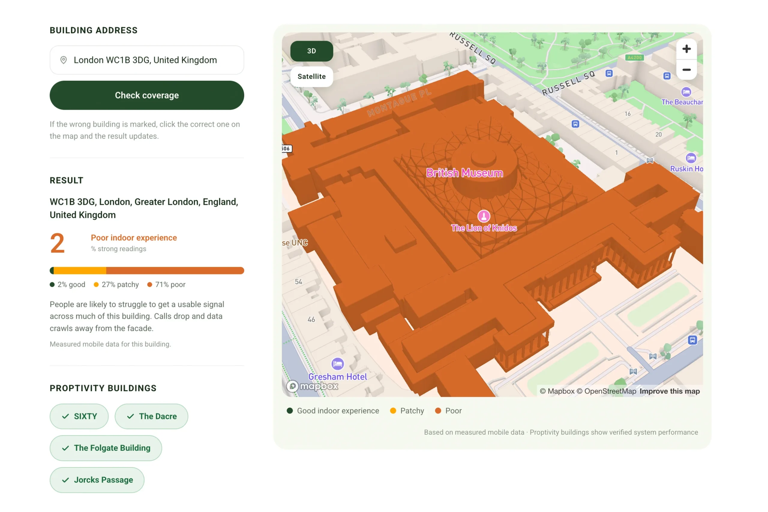
How good is the mobile signal inside your building?
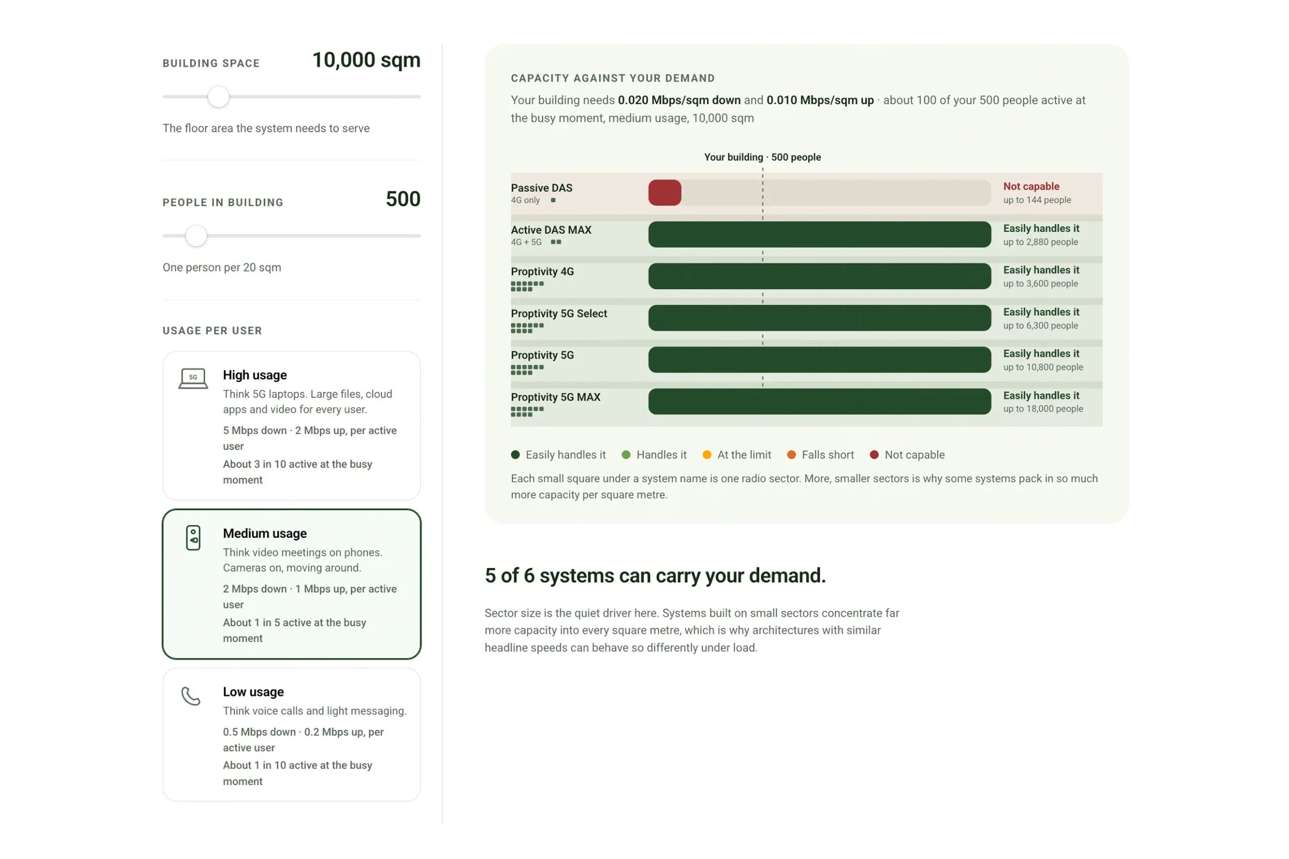
Which indoor system can carry your building’s demand?